Book designers are typographers by necessity, if not by nature. Content may be king, but content is almost always text. Text must be displayed for a reader, either on the pages of a book, or on a screen.
To display text, you need to use a type font. The font could be chosen by a designer, or it might be a default set up by the engineers who create digital reading devices.
When it comes to fonts, designers have strong feelings. While you’re sitting at a restaurant trying to decide what to order, the book designer at the next table is examining the type fonts used on the menu and how the kerning looks.
I like Volvos, maybe you like Chevys. Same with type fonts. Some designers like Palatino, it does nothing for me. But when you find a font you love, it’s a relationship that can last a lifetime.
For many years my favorite typeface for book design was Bembo. One of the reasons I prize Bembo for book typography is the way it smoothly flows on the page. It’s easy on the eyes even for extended reading, and it seems plain and without any eccentricities.
It’s The Good Old Style
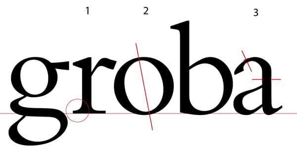
Bembo is an oldstyle typeface. That means that: (see the illustrations that correspond to each number)
- The serifs are bracketed: there’s a curved connection between the serif and the stem of the letter.
- An axis drawn through the thinnest part of the round letters will lean to the left.
- The difference between the thin strokes and the thick strokes is not that great.
These oldstyle typefaces were modeled on humanistic calligraphy. The earliest type creators and printers of the fifteenth century used as models the books that were handwritten by scribes practicing a craft that was—even then—hundreds of years old.
Blow it Up
It may seem odd that our modern digital type fonts derive from models that are ancient. Or that the pages of today’s bestseller might contain traces of the scholars of the Renaissance, the same scholars who rediscovered and reissued the books of antiquity 500 years ago. But it’s true.
Despite the smoothness that Bembo shows on the page, a look at the enlarged version above tells us a great deal about its origins.
The three characteristics of the humanist typefaces I listed are all due to one influence: the way the calligrapher’s flat-edged pen forms letters. As the pen held by a right handed writer passes through the circle of the round letters, it naturally forms the tilted axis.
As the scribe finishes each stroke, his pen naturally creates the little serifs, or ending strokes on the letters as he moves to the next letter. This helps tie the letters together into words, and is the chief reason we prefer serif typefaces for text.
And the pen, although naturally creating thin and thick strokes as it moves through the letterforms, will never make a really thin line.
Not only that, but when the letters are enlarged as much as they are here, we start to see all kinds of oddities and eccentricities that are invisible at normal sizes. The branch of the “r” quivers a bit, the top of the “a” has flat spots, and “g” gyrates in several directions at once. What happened to the smooth flow we’ve come to expect from Bembo?
Truth is, a perfectly uniform typeface would be difficult to read for long. It would look pretty sterile, even boring, set in the massive blocks of text that make up books.
It’s because of its eccentricities that Bembo looks so beautiful on the page. All the variation in the individual letters creates color, rhythm, and the flow this typeface is known for.
Aldus, Francesco and Pietro Come Calling
But there’s more in Bembo’s DNA than the traces of calligraphers copying old Greek and Roman originals. Drill down a little more and another layer of cultural history falls open, with surprising connections.
The art of the printed book spread quickly for the times, moving from the innovations of Gutenberg around 1450 near Mainz, Germany, to other cities in Europe.
Aldus Manutius, a humanist himself, set up his Aldine Press in Venice around 1490. Aldus took as his symbol the image of a dolphin around an anchor, which is derived from the ancient symbol for Beirut, Lebanon. This same symbol, by the way, was used for many years as a logo by Doubleday Books. Aldus’s sign also included the latin phrase Festina lente, or “hasten slowly.” (Note the dolphin and anchor motif on the wall behind Aldus, above.)
Aldus was an entrepreneur and an innovator, and soon became the most prolific publisher and printer in Renaissance Italy. He invented pocket editions of books with soft covers that were affordable for a wide range of readers, organized the scheme of book design, normalized the use of punctuation, and used the first italic type.
If you recognize Aldus’ name, it may be because the company that created Pagemaker, the first widely used layout software, and that spurred the whole desktop publishing revolution, was named Aldus, and used his image as their logo.
Bembo Is Born
For the design of his italic Aldus turned to Francesco Griffo, who made the molds in which the type would be cast. Then Aldus decided he needed a new typeface that he would use first to publish an essay titled De Aetna by the famed scholar Pietro Bembo.
“In February 1496, Aldus published a rather insignificant essay by the Italian scholar Pietro Bembo. The type used for the text became instantly popular. So famous did it become that it influenced typeface design for generations. Posterity has come to regard the Bembo type as Aldus’s and Griffo’s masterpiece.” —Allan Haley, Typographic Milestones
Bembo was a very well-connected cleric who was friendly with the Medicis and had an affair with Lucrezia Borgia. He influenced the development of the Italian language and assisted in the revival of interest in the works of Petrarch. Bembo was also instrumental in establishing the madrigal as the most important secular musical form of the 16th century. The portrait above is one of two painted of him by Titian.
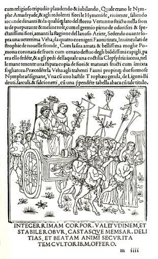
Griffo continued to refine the design of his roman typeface up until the publication, in 1499, of the Hypnerotomachia Poliphili, a page of which is shown above. (Certainly one of the strangest and most mysterious books ever published in any age, the Hypnerotomachia Poliphili, by the way, was the unusual centerpiece of the recent bestseller, The Rule of Four.) It is this design that has been known ever since as Bembo.
The Bloody End of the Story
Just as Aldus Manutius was about to achieve a government-authorized monopoly on the printing of Greek literature, he and Griffo had a falling out. Griffo left Venice for Bologna. The last notice we have of him is in 1516, when he is charged with beating his son-in-law to death with an iron bar. It’s thought he was hanged for his crime, a strange end to one of the most influential type designers of all time. To this day, italic fonts are known in Spanish as letra grifa after Griffo.
The design of Bembo was a clear attempt to bring the humanist script of the finest scribes of the day to the printed page, without slavishly following the more formal lettering of the day. It would later serve as the chief inspiration to Claude Garamond, among others. Typefaces based on his work include Poliphilus, Cloister Old Style, Aetna, Aldine, Griffo Classico, Dante, and Adobe Minion.
Griffo has never received adequate recognition for his enormous contribution to type design. —J. Blumenthal, The Art of the Printed Book 1455-1955
So the next time you’re scrolling through your font drop-down list, think of the book designer. It’s not so much that all this history is present in his mind at all times, not at all. But in the meditative trance that settles over him as he lays out his book, the Bembo flowing from line to line to paragraph to page, the ghosts of clever Aldus, suave Bembo, and doomed Griffo, the bloody bar still grasped in his hand, might rise, wraith-like, from the pages.
Even the prosaic act of flipping open the pages of a book can sink us into the accumulated history of western culture. Typefaces like Bembo are unique repositories of much of this history, encoded with mysteries within their subtle designs. It’s the province of the typographer to use each of these typefaces to the best effect for the book at hand. And with Bembo comes all its history, as alive today as it has ever been.
Joel Friedlander is the proprietor of Marin Bookworks, a publishing services company in San Rafael, California that has launched many self-publishers. Joel is an award-winning book designer, a self-published author, and blogs about publishing and book design at TheBookDesigner.com.
Get an Editorial Review | Get Amazon Sales & Reviews | Get Edited | Get Beta Readers | Enter the SPR Book Awards | Other Marketing Services


Illuminating article. I always write in Palatino, but if I had to choose another it would be Garamond. I asked for something in that family for my books.
Great article for those of us who maybe love our typefaces a little bit too much. 🙂 On that note, here’s you font joke of the day: http://pics.blameitonthevoices.com/032009/franklin_gothic.jpg
Lovely essay about obscure stuff, just what I like! I set my book in Garamond except for story titles; I’m glad to be introduced to its ancestor. All the richness of typography and design that is lost in the current e-book world is one of the reasons I procrastinated putting my book on Smashwords. I surrendered, as the market dictates, but I still cringe…
@Mike, your book looks lovely, and I think Garamond was a great choice. Glad you’re still enjoying Palatino, I think I’ve been “overexposed.”
@Matt, LoL, thanks for that. I’m sure old Ben would enjoy the joke.
@Brent, the ebook situation is a bit dispiriting for typographers. Except for PDFs it’s really hard to control what the book will look like. One of the reasons I wanted to write this article was to hint at how much “backstory” is in the typefaces we use every day. Maybe Apple’s much-anticipated “tablet” will keep us a bit more connected to our common past while making great technology available. Hey, a guy can hope!
Either it’s the first typo I spotted today, or it’s a word I don’t know: inspiriation. (I am happy either way.)
Ha, good catch! This article, written in 2009, was before my time. Corrected and appreciated!