When it comes to self-publishing your book, avoid the most common pitfalls to make the most of your opportunity to become a bestselling indie author!
Scrimping on the Book Cover
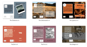
If money is an issue, ask at your local art or design school if you could launch a book cover contest. The prize? Seeing the cover in print! You could also ask around at work or at a club or organization you belong to. There are many people using programs such as Photoshop if you aren’t design savvy.
And never, ever settle for the first design you are offered as part of a publishing package. We’ve seen some real duffers offering cover designs that leave us dumbfounded when we discover the cost of one design is in four figures! Have a look at this collection from Lousy Book Covers and you’ll get the idea.
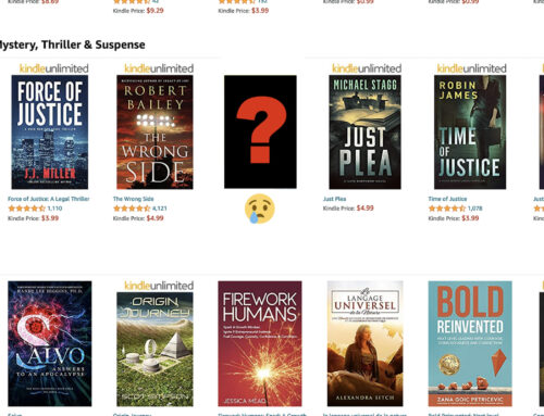
Make sure your cover is eye-catching and clean, and can be seen at a distance because thumbnails on Amazon, Barnes and Noble and most other book sites are going to use a thumbnail to show your book off as a first point of sale.
Take a look at Joel Friedlander’s articles on cover design over at The Book Designer to start you off.
Not Adding a Table of Contents
Having a TOC as it is known, is a great way to help readers who use e-readers and computers to read e-books navigate your book. This video shows how to do this in Microsoft Word. A lot of books don’t feature a TOC in e-book format and this can be really confusing to find your place again if the book has no bookmark or page numbers. Remember, page numbers are replaced by percentage read on some e-readers, so you need to consider how your reader will find their page otherwise.
And here’s a piece from indiedesignz on how to do it in Calibre, a tool that helps format your e-book.
Formatting Incorrectly for e-Readers
Formatting is hard, even when using automatic formatting tools. You will be best to use a combination of tools, starting with the basics and passing over your document many times. Do not scrimp on this job, it’s immensely important as readers will review the formatting if it doesn’t work, which will drop your book sales straight away. Remember, consumers are not trained reviewers and won’t just review the quality of the writing.
There are certain points to remember when formatting for an e-book versus a print book. You can find out all of the tricks by looking at this helpful free book from Amazon:
Not Spending Enough Energy on Editing
We say this many times over, and I am constantly surprised by the number of self-publishers who go ahead and publish anyway, even when they know themselves their book contains errors! This is death to your book sales, and will not be ignored by readers, not just for this book but for all your books connected to your name.
Editing is fairly expensive and tedious, but if you wish to make sales and give up the day job, it is vital you edit your work. We offer it here for less than a dollar a page.
Two-part edits are minimum: a proofread to find spelling and grammar errors, and then a formatting pass, followed by a structural edit to the actual story and characters. This will flag up any parts of the book that do not communicate well and parts where you’ve dragged on or skipped over detail that could become boring or confusing to your readers.
In such a tough and competitive market an edit is an essential, professional process for any serious writer, even if you think you can spell, write, format and structure I bet you money an editor will find a bunch of stuff that you had missed, wood-for-the-trees style.
Insisting on a Fancy Font
We’ve talked about choosing the right font for your book before, and nowadays given most reading happens on an e-reader it’s even more essential to get it right. Basically, for e-readers it’s best to stick to the following fonts if you want your book to be easily read by all:
- Times New Roman
- Verdana
- Calibri
- Garamond
- Tahoma
This is because older e-readers cannot embed fonts, i.e. read the font being used in the document and apply it. This issue will soon be outdated, but for now it’s better to be safe in the era of one-star reviewers slapping their opinion on everything.
If you must be contrary and use a fancy font for effect, it’s best to make it a .jpg and place it as an image in the book. And there is the headache, because images behave badly in e-book formatting, so you should ask yourself “is it essential to my book?” I cannot think of a time it would be absolutely essential. But this is the best way to ensure the header will show up correctly, such as these ones I made:

![]()

Not Getting Reviews From The Right Places
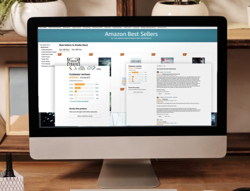
Reviews are important for promotional copy and essential to sales. But how to get hold of them in the first place? Both free and paid reviews have their place. Asking Amazon top reviewers who seem to review a lot of books is a good plan, and you will have to be prepared to send a free e-book to the reviewer. Don’t assume they will review you. Ask if they think it’s a good fit and provide a synopsis and cover with a link to the book on Amazon.
You shouldn’t feel worried about asking friends and neighbors for reviews – this isn’t illegal or anything. Just ask them not to give you five stars automatically, and assure them you want an impartial review. You can gift books to anyone who asks about your book using Amazon’s book gifting system, or use a “download PDF” link on your website.
Maybe you belong to a special interest club, or you could contact organizations that may want to review your book for their periodical. Is it a local book? Ask local papers and magazines if they’d like to review it. Send a press release they can quote from – this will mean they can cut and paste copy and get you seen quickly.
Making your book free for a while will increase your chances of being reviewed, and you should throw yourself into forum life on Goodreads and other writing circles to garner and swap reviews.
Beta readers are always up for a freebie. Search for beta reading groups and follow the guidelines to offer your book up in exchange for reviews. Lena over at the Beta Readers’ Group on GR says,
It’s simple: Post a new topic. Do not post on someone else’s thread.
Post your book’s genre. The more specific the better. You do not have to write ‘seeking beta’ as that’s all that will be posted here.
Mention how long the work is (completed novel, short story, etc).Your post will look something like this:
2 chapters of YA Fantasy/Vampire RomanceThat’s all there is to it!
This beta method seems much better than groveling for free reviews from bloggers with their own sites who make you fill out a million questions about your work then never even get back to you out of courtesy. I once filled out sixty of these “review requests” for an author of some note I was working with, and only one person acknowledged the book and I got three lines on an interior page about the book on a low ranking website out of hours of work. It was unusable.
There are a few quality websites that will (very gracious of them, I feel) allow “the DIY peasants” to submit their self-published book “for consideration” for a free review, and they will decide from their ivory tower whether you are worthy and then take four to five months to review it in less than 300 words, in which time you’ll have to just wait and see. These include Booklife’s Publisher’s Weekly Select, which is probably the most worthwhile place to try if you haven’t got a pressing deadline.
Professional reviews, as we offer here, are intended to give you a boost and exposure as well as giving you excellent, professionally-written copy to promote your work. Paid review sites have good quality page ranks and lots of readers, and the copy can be quoted on your author profile pages across the web. We just did a review of the top 5 services here.
Over-blogging your book
 The biggest mistake authors make with blogging is only blogging about their own book, and constantly going on about selling it. If followers keep seeing the same message, that is, “buy my book” in their feed, they may well un-follow you, especially if they already bought your book. Bear in mind they won’t come back when you write the next one.
Instead, write about your experiences with writing and how you researched your book, and the subjects you know. This will be far more likely to get you sales as your readers become endeared to you as a writer – you will be cultivating a fan base, rather than boring your friends and family out of ever acknowledging you as a writer again.
Try blogs such as WattPad and NaNoWriMo to get cracking instead of the usual paths of Facebook and Twitter. You’re more likely to meet book fans and those who like to get involved with writing, cultivating your very being into a literary shape rather than turning you into a worn-down social media ghost checking “likes” every five seconds.
Get an Editorial Review | Get Amazon Sales & Reviews | Get Edited | Get Beta Readers | Enter the SPR Book Awards | Other Marketing Services








For covers, I recommend going to inexpensive stock photo sources such as:
http://www.bigstockphoto.com/
http://depositphotos.com/
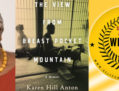
And spending a lot of time–I mean hours–looking for just the right photo for your cover. Remember, if you buy it in a large enough format, you can frame it differently, stressing just part of the scene. Get the highest pixel count you can so it will be sharp.
Then use that photo for your entire cover. A great picture means a great cover without any great design skills. Take care to position the title carefully and make sure it has enough contrast with its background. Having just the right place to put a title is one factor I look for when I search pictures. Keep your titles short.
All good advice there methinks and well worth paying some attention to.