Having reviewed books at SPR for sometime now, it is a huge bugbear of mine to have to read a book in a horrid font. You see, I studied graphics at university and did my thesis on typography. And so this article is refreshing for me, and I hope self-publishers everywhere will take heed. Please do.
Wise Ink published this advice on fonts to be used in your self-published book – wise indeed!
The font that you choose for your book is more important than you think. It contributes to creating a more compelling book that readers are drawn to. Your choice also says a lot about you as an author. Different fonts can look more credible and professional, while others look tacky and overused. We tend to find serif fonts, like Times New Roman, more believable than sans serif fonts, such as Comic Sans MS. It’s important that your book looks more convincing than the books next to it on the shelf.
Choosing the right font is also vital for readability. When looking at a book online or an e-book, sans serif fonts tend to be easier for us to read. But when we read a book on paper, it is much better to use a serif font for the body of the text. A combination of sans serif and serif can be used to make a book more interesting and easier for the reader. Using sans serif font for things such as title and chapter headings, but serif for the main text, will create a believable and visually appealing book for your buyer.
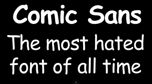
Elsewhere, my absolute nemesis Comic Sans, originally designed from the old Batman speech bubbles (hand drawn I may add), and designed for use in cheapskate comics, gets the dressing down from Distribber director Jason Brubaker at reMIND, my favorite point being,
You will instantly look unprofessional to anyone who has already learned this lesson no matter how good your art or story may be. Designers and Letterers will want to roundhouse kick your face.
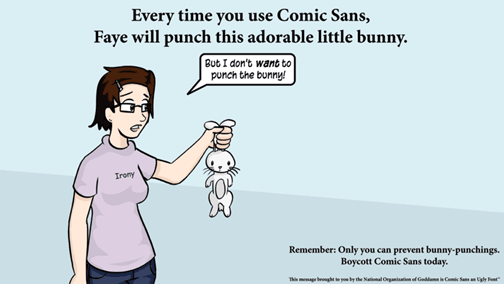
The hatred of Comic Sans is so great, that this website exists.And this Flickr, that absolutely shows where Comic Sans belongs, i.e. not in your novel.
Before moving to the US, I worked at Cambridge University Press, where a book called “The Psychological Study of Typography” was printed by Cyril Burt in the mid-50’s. Ian Whiteman describes the book on his blog,
He [Burt] determines the relative optimum line length and leading for given type sizes and the essential ‘colour’ of the text i.e. lack of what are called ‘rivers’, white gaps caused by excessive inter word spacing, all to provide an easy reading experience.
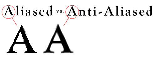
There is much to take into account, and e-readers only make the job of picking a font more complicated. A Russian site, E-ink Reader, offering fonts for use on e-reader books, talks about the problem of the reader being able to choose the font they read in. Will their choice throw your book out of order? How will your chosen font look if you use an anti-aliased font? An anti-aliased font is one that will not appear pixelated on a screen when enlarged, but,
The software of certain models of the electronic book can have or not have function of anti-aliasing of fonts. If function of anti-aliasing is not present (or it is off) every symbol looks like black colour on white without semitones on the screen. Thus direct horizontal and vertical lines of each character print accurately and beautifully, and the bent and inclined lines of characters are traced by “stairs”.
Joel Friedlander at The Book Designer probably has it right,
Luckily, as computers have become more powerful and users more sophisticated about typography (the art of designing with type) there has also been an explosion of new fonts from lots of new designers.
So it might surprise you to find out that by far the best fonts for use in books are the oldest.
For a smorgasbord of resourceful articles on typography, Smashing Magazine has complied this list to help out the budding self-publisher.
Get an Editorial Review | Get Amazon Sales & Reviews | Get Edited | Get Beta Readers | Enter the SPR Book Awards | Other Marketing Services












Leave A Comment