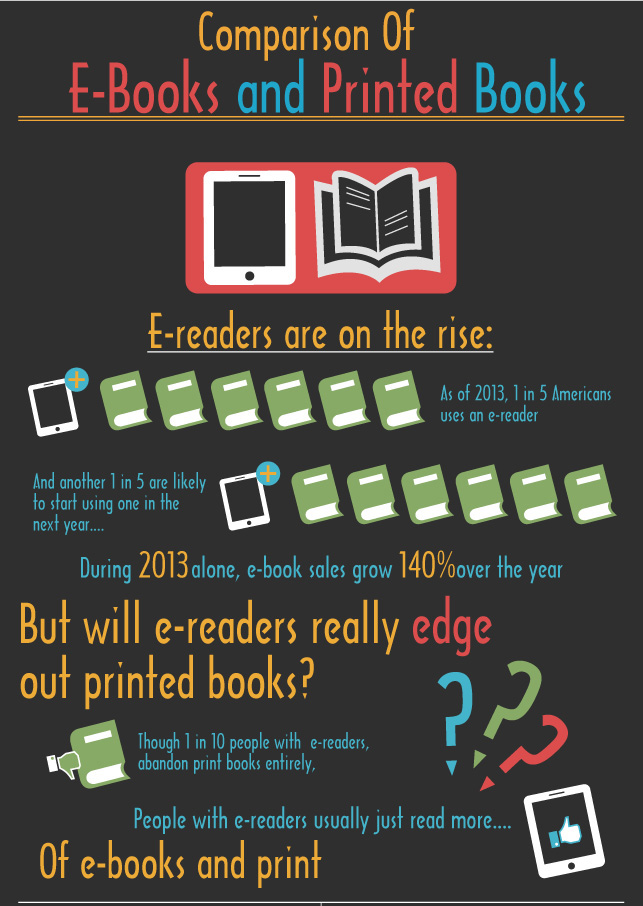
This Infographic is produced by Coupon Audit and Self Publishing Review
.
Get an Editorial Review | Get Amazon Sales & Reviews | Get Edited | Get Beta Readers | Enter the SPR Book Awards | Other Marketing Services

This Infographic is produced by Coupon Audit and Self Publishing Review
.
Times are certainly changing. I’ve noticed that my ebooks now alter how I do print books, particularly with the last two books.
The first, Hospital Gowns and Other Embarrassments, built from a print base, In my case that meant no pictures and an effort to keep the page count down so it could sell for less. Only with the digital versions did I decide to add a picture at the start of each chapter almost as an afterthought.
The second, My Nights with Leukemia, flipped the process and was built on a digital base. From the start, I assumed each chapter would open with an appropriate picture, typically a hospitalized child. And those pictures in b&w were as much a part of the print version as the color pictures were for the digital.
I also didn’t fret the page count. In fact, when the page count ended up just under 200 pages, I brought in another chapter to raise it to 204 pages. Why? Because having an obviously larger page count in the print edition is likely to impress those buying the digital edition that they’re getting a lot for their money (which they are).
I liked how My Nights looks so much in print and digital, that I then revised the Hospital Gowns to include pictures, taking care to keep the same ISBN. One of my rules is that I don’t have to change the ISBN if: 1. The content doesn’t change greatly and 2. The page count remains the same.
In my first revision of Hospital Gowns, I kept the page count the same by carefully inserting small pictures into the body of the text. I wasn’t happy about that though. It made the digital and print editions too different. So I created a third revision that placed large b&w pictures at the start of each chapter just like large color pictures open each chapter in the digital version. Fortunately, the body text font size was a bit larger than necessary, so I kept that same 164-page count by dropping the font size until the new book had the same length as the old.
That’s a big change. Ten months ago, the print version set the standard and the digital followed behind. Ten months ago, I assumed my typical customer was buying the print version. Now the digital version drives how my books look, with the print version following. And I assume that my typical customer is more likely to get the digital than the print.
If you’d like to see the results, both Amazon and Apple have downloadable samples of the digital version and Amazon has a look inside for the print version. There was, however, a hitch with the Apple upload, and only today was I able to upload the third version of Hospital Gowns to the iBookstore.
Both books illustrate a useful technique for making both digital and print editions look good and appear similar. Each chapter opens with a page break followed by the title and that chapter’s picture. That’s not only a vivid way to open a chapter, it prevents the awkward page break problem that’s common on ebook readers.
–Michael W. Perry
Hospital Gowns and Other Embarrassments: A Teen Girl’s Guide to Hospitals
My Nights with Leukemia: Caring for Children with Cancer