Although I signed with a great publisher for my e-book, I opted out of print, deciding to self-publish a paperback edition of my novel. Doing my interior and cover design would allow me artistic control, for better or worse, of the product.
Having more time than cash, I wanted to see how much I could accomplish without spending any money. That meant doing everything myself.
What’s the goal?
One of the first things that struck me, while browsing book covers online, was how many were unreadable when displayed as icons. Not surprising, really, since they were probably designed with the book in mind and not the icon.
Browsing book covers in stores, I came away with a different sense of vision. I suppose the artwork was the same as what was displayed in that little icon online, but the feeling it conveyed, at least to me, was entirely different.
But, realistically, was my book going to be on shelves in stores? Not likely. So, where would people see the cover? Online. And after they had purchased it. People weren’t likely to make their decision to buy based on the back cover.
So, my goal was to come up with a cover that looked great in person and as an icon. That meant keeping it simple.
Something that would have helped, had I known it upfront: There are some colors you can get in that pretty little icon that won’t print so well on paper.
Cover concepts
Some of the best pointers on cover design were right here. I read as many posts as I could, trying to hold my impatience in check. I browsed through various sites for stock photos, looking for ideas.
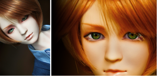
The protagonist in my novel has a genetic disorder that alters facial shape. Although I could edit a photo to simulate the disorder, the fine print in the stock photo licensing pretty much prohibited portraying any of their models as my protagonist. So, stock photos were right out.
Large eyes relative to small nose and mouth. Anime might have worked. Some of it was amazing, but I didn’t draw and couldn’t afford to pay a high-end artist. Then I stumbled across flickr and found some kind people willing to grant me the right to use some of their photos to do my cover. In turn, I would acknowledge them in the front matter of my book.
Tools
I had used Photoshop. I loved it but didn’t own a recent version. And can’t afford it. So, I downloaded GIMP. It was free and it did almost everything I needed to build my cover.
The only drawback is that GIMP doesn’t do CMYK, which is exactly what my printer requires. Fortunately, Smoking Gun Graphics has a free RGB to CMYK converter here.
Getting started
I played around with GIMP and with different cover concepts for months before converting to CMYK. My recommendation is that you get a feel for the RGB-CMYK differences first.
You’ll find that working in JPEG isn’t the best idea. It’s possible to lose image quality every time you save the file. XCF is the native GIMP format I use. TIF is what the converter wants. PNG is great for using on the web.
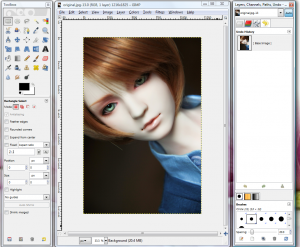
I loaded the original JPEG file in GIMP and saved it as XCF and then as TIF.
Color manipulation
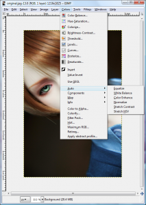
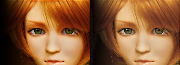
GIMP provides a number of useful tools for changing hue and saturation, including an automatic color enhancement capability.
If you duplicate the layer first, then you can mellow out the results. Layer | Duplicate Layer, Color | Auto | Color Enhance, Set the layer opacity (alpha) in the Layers, Channels, Paths window until the colors are right, Layer | Merge Down to recombine the two layers.
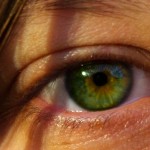
There’s no space here to cover everything I did. Nothing special. I rotated the image, cropped it, and changed out the eyes with another image that someone had kindly let me use.
I also resized my image to be the proper height for my paperback. Nine inches at 300 pixels per inch plus a 75 pixel margin. That’s 2775 pixels.
I converted the image from XCF to TIF and converted the TIF to CMYK-TIF to see how the image would look in the product.
Wasn’t that easy?
Building a cover
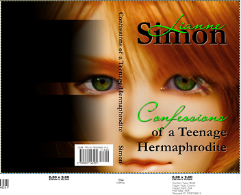
Once I finished the interior formatting, I knew how many pages were in the book. My printer has an online application that will generate a cover template based on book size and number of pages. It requires an ISBN because it generates a bar code for you.
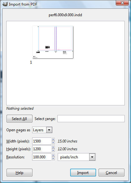
For GIMP, I use the PDF format of the template. I started GIMP and dropped the template into the empty window. A pop-up shows the file contents and allows you to set the resolution to 300 pixels per inch.
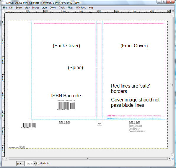
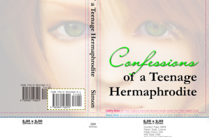
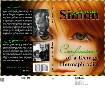
Templates vary from printer to printer, but they should look something like:
The only thing on the template that you’re allowed to move is the bar code. Nothing may be resized.
Placing items on the cover
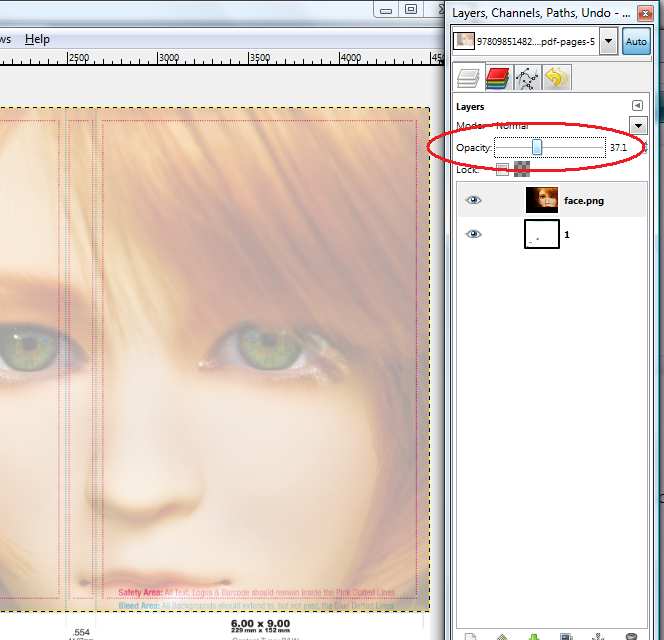
I started by dropping a PNG copy of the photo into the window. In the Layers, Channels, Paths, etc window, I set the opacity to about 40 so I could see the red and blue lines on the template.
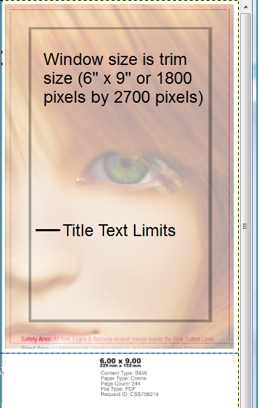
The red lines indicate where text is too close to either the trimmed edge or to the fold between the cover and the spine. This is a mechanical limitation and not an esthetic one. In practice, cover artists use a stricter border for text. So, I added a layer with a more realistic border. I also added a layer that frames the front cover trim size so I could see what the cover would look like by turning the layer on.
Adding Title Text
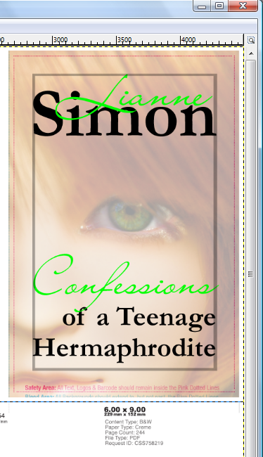
I tried a number of fonts and layouts for the title text and finally settled on mixing two fonts, the same two I had used on the book’s interior.
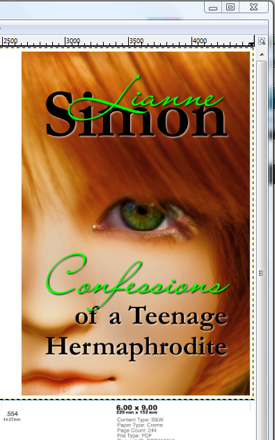
Although I liked the placement, there wasn’t enough contrast for the text to be readable when the cover was turned into a small icon. So, I added drop shadows to the text.
Drop shadows on text
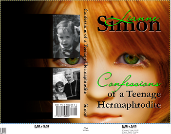
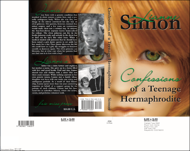
GIMP does nice drop shadows, but it’s kind of particular about adding them to text. To avoid complications, I make sure to Select | None, select the move icon in the Toolbox (not the Text icon), select the text layer in the Layers, Channels, Paths, etc window, and then Filters | Light and Shadow | Drop Shadow to add the shadow layer. For my green text, I set the drop shadow color to black; for the black text I set it to white. The default opacity of drop shadow layers is 80. I set them to 60. With the background opacity set to 100, here’s the result:
Don’t be disappointed if it takes a while to get the look you want. I’ve built at least twenty different covers. Some were dreadful.
Spine text
Getting the spine text right takes a little time. Here’s a trick: GIMP has a measuring tool. If you measure the spine, you can properly size the text for it in horizontal mode and then rotate it once you’ve got the size right. The measurement icon is in the toolbox. The measurement results are displayed on the status bar at the bottom of the window.
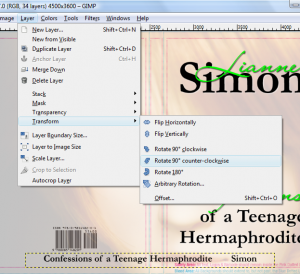
Once the spine text has been sized and spaced properly, rotate the text layer using Layer | Transform | Rotate 90 counter-clockwise.
The bar code
I wasn’t sure what I wanted on my back cover, except for the bar code. I copied it from the template by selecting the template layer in the Layers window, duplicating the layer using Layer | Duplicate layer, and then cropping the duplicated layer down to just the bar code. Note that you can change the z-order by selecting a layer and clicking on the green arrows at the bottom of the Layers window.
I moved the bar code above the photo in the z-order and then selected the move icon in the Toolbox in order to drag the bar code to where I thought I wanted it.
Back cover
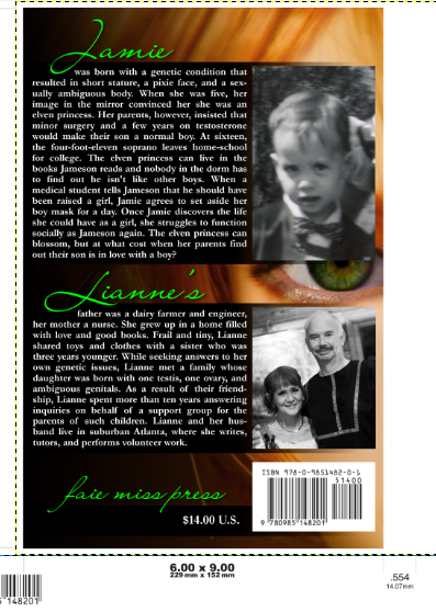
I finally decided to limit the back cover to three items: The publisher name and bar code, a blurb about the book, and a blurb about the author. I divided the back cover into areas, allocating space in the proportion necessary for the three items. To improve the contrast, I added gradients to darken the photo. The gradient tool is in the Toolbox. I created a new layer for each gradient, used the selection tool to select the area in which I wanted to do a gradient, and then used the gradient tool to draw the gradients.
I added titles for each of the areas.
Finally, I added the text for the blurbs.
To see what the back cover would look like, I duplicated the front cover window layer, flipped it horizontally using Layer | Transform | Flip Horizontally, and positioned it to show the back cover. At that point I decided to turn off one of the black gradients to lighten the background a bit.
The blurb text is right up against the red lines of the template. It might be good to go back later and increase the margins. It’s one of the things I keep adjusting.
Proofing the cover
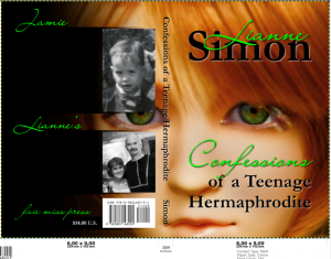
Before I could have a proof copy printed, I had to convert to CMYK one last time. So, I wrote out the entire cover in TIF format and converted it. Note how the green text color has changed.
Conclusion
If you have time and no money, GIMP is a great way to go. I’m not sure how much better someone with Photoshop could control the RGB to CMYK color mapping, but it might be worth the cost to pay a professional to do the color adjustments and conversion for you.
Assuming you can get your colors right, it’s possible to do a professional-looking cover yourself, using GIMP. The question is: Can you, the author, also be enough of an artist to design a cover that is as good as your book? I’m sure I’ll go through a few more iterations before I’m happy with mine.
Get an Editorial Review | Get Amazon Sales & Reviews | Get Edited | Get Beta Readers | Enter the SPR Book Awards | Other Marketing Services












Thanks for this amazing post! I’ve created a couple of covers in GIMP as well. It has limitations (text manipulation could be easier) – but Photoshop can have too many options. For anyone daunted by Photoshop (or can’t afford it), GIMP is a great alternative.
Fantastic. Thanks so much for this. Writers are always asking me how to create book covers for free. This article is a god-send.
I’ve never used GIMP, and appreciate the clear instructions; I know writers will appreciate the time you put into this tutorial.
Thanks, Lianne. I’ve deliberately chosen simplicity for my covers, and GIMP is perfect — and free!
If you’re on a Mac and you need to shift RGB to CMYK, you can use the built-in ColorSync utility. Here’s a discussion of it: http://superuser.com/questions/116648/can-i-convert-an-image-from-cmyk-to-rgb-in-mac-os-x
This is amazing. I’ll download the programs right now!
Thanks so much for sharing!
Ariel Ceylan