This post is a part of Ebook specific cover design series.

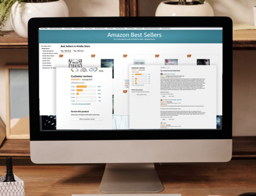
On a web page a book's cover is surrounded by information it used to convey itself - like title and author
There are three approaches to covers:
– ebook cover is a copy of a print edition,
– one cover is designed for both print and digital edition,
– a cover is designed for ebook only.
I’d like to focus on the last one as it creates much more possibilities than you would originally think of. And all this can happen if you just switch the perspective.
A different approach, free from constrains typical for print production – and taking into consideration circumstances typical for digital environment – can bring unexpected and stunning results.
In this post you’ll find tips on how to benefit from a context of the ebook. In the next posts you’ll find tips on how to play with resolution, proportions, colors, shape and animation.
The context can be created by a web page where a book is displayed. It can an ebookstore or your blog. Another dimension is a presence of devices used to read ebooks.
Web page
When you’re going between bookshelves in a bookstore, you need information about books you see. This information is provided by the covers. It’s the book’s cover to make you reach for it and open.
This is different if you browse for a book on the Internet. The image of a cover is usually small and in many cases the text is not readable until you enlarge the picture. Most importantly though is that information about the book is provided by other elements of a web page. That means that the cover itself is not the only source of essential info about the book. In fact, it doesn’t have to be.
On a typical book page in an ebookstore, next to the book cover you see the title, subtitle, author, price, discounted price, book description, editorial reviews, customer reviews, similar books and many more. A content of a web page conveys much more information than front and back covers of a print book altogether.
The opportunity to catch on is that you can remove all written information from the cover. Having in mind that image of the cover is usually small, you can decide to make room for a main visual and remove all other elements which will be the less and less useful if the cover will be smaller and smaller.
From now on you can focus on the main idea of a cover, which will have more room to convey the topic and genre of the book.
A great example of the simple and powerful cover, which is designed to deliver a unique picture is Seth Godin’s Poke the Box. You see the cover once and since that time you’ll easily associate it with the book. No author or title is needed – you know it.
Take also into consideration that if you browse for a book within the ebookstore, you’ll have a list of results with a thumbnail of a cover plus a title, author and price. A thumbnail of a crowded cover can be a mess. Why should it repeat information delivered next to it if it can be a clear and memorable visual, decoded even from a 100 x 100 px thumbnail?
Covers without book title or author are going to be more popular as more and more purchases, also of print books are made through the Internet. Internet is the place we’ll see a book for a first time. If we don’t buy it from Barnes & Noble website right away and go to one of the its bookstores later on, the cover will be familiar already. In many cases a cover of a print book doesn’t have to be self-explanatory any more.
Device
The next big thing is a context created by a device devoted to read it. It can be an ereader, tablet or smartphone.
We’ve seen many wonderful ideas of print books’ covers playing with dimensions as well as a paper texture. The same thing can be done for electronic books. It’s surprising that there are so few examples of ebook covers referring to specific surrounding created by the device.
Imagine the reader opening your book on a tablet. The space to use and play with is the screen. Here are some ideas to inspire you:
![E1_iPhone E-opowiadania [Tom 1] - Niżej Podpisany](https://www.passwordincorrect.com/wp-content/uploads/2008/11/E1_iPhone1-138x300.jpg)
Play with the depth of a device; a cover can create a feeling that the tablet is thicker/thinner than it actually is or that is has an infinite depth. Let the cover become the part of the device – imagine it’s the back of it, for example.
2. Elements of the user interface
This is what I’m actually doing with most of my ebook covers. See a picture on the right – I’m using elements of an e-reading application (as well as exact screen proportions) to make it look good on a smartphone or a tablet.
3. Realistic effects on a screen
Imagine you have as a cover an image of a broken tablet screen (how would it look if a bullet went through it?). Or imagine you have a detective story with a cover looking like someone left fingerprints on a screen. Screen and pixels are the same material to play with as paper and paint in print books. The rest is your imagination.
* * *
In my opinion, opportunities and inspiration will come to you as soon as you stop thinking of a book cover of a physical print book and start to think of it as a part of digital environment.
And it’s not only applying to expensive multimedia book applications developed by the best designers in the world. You can also come up with a fresh idea, if you just start thinking of what to do with a 500 x 750 px blank space.
Get an Editorial Review | Get Amazon Sales & Reviews | Get Edited | Get Beta Readers | Enter the SPR Book Awards | Other Marketing Services








Piotr, once again I appreciate your technical advice on book publishing. You also make me wonder. Are relatively unknown writers such as myself in the same position as Seth Godin? If I left off the book title and my name as author from my ebook cover, wouldn’t I be considered strange and presumptuous? Like all those other “self-publishing” writers? Wouldn’t potential readers dismiss me without further consideration?
Hi Ron,
I don’t think so. If people don’t know you, repeating the name on a cover doesn’t help a lot. I would say that that it’s Seth Godin to have doubts. People know him, look for his books and we see no name on a cover…
The thing is that together with context we have another issue: size. You don’t compare 6×9 inch books on a shelf. You compare 115x115px thumbnails. And the simpler the thumbnail is, the more chances to click to the book. Read this post with details: http://www.passwordincorrect.com/2011/07/22/ebook-specific-cover-design-2-size-and-resolution/
I’m so glad you posted this. You make excellent points and I hadn’t considered incorporating a reading device into the cover image. Good idea!
What I had recently concluded was that author names are largely redundant on the eBook cover. When I browse physical books in a bricks-and-mortar shop, I often pick up a book because I recognise the name on the spine, or cover if on special display. No one does that when visiting on an online retailer.
So I’ve engaged with an artist to design a new generic look to our Greyhart Press book covers, a band on the left that has title, author and our brand identity… then leave the artwork alone to do its job. Some of my authors aren’t too happy that this squeezes their name, but I point out that no one selects eBooks for purchase after seeing the author name on the cover; the sales page shows the author name more clearly anyway.
Really helpful info, thanks!
My name is Kit Foster, and I’m a graphic designer (and novelist) from Edinburgh, Scotland. I’m currently trying to build by design business, which specialises in book cover design for self published authors. I provide a professional, personal, good quality and above all cheap service, and I would love it if you could take a couple of minutes to stop by my site and check out my work! http://www.kitfosterdesign.com
Even if you’re not looking for a cover designer, any feedback or comments would be really helpful to me! Cheers!
Piotr, I’m curious, what do you think of services such as 99designs or http://getbookcover.com ? What do you think is a better idea: hire an illustrator or buy a complete book cover?