You never know where a connection may be lurking.
I have Moo cards of all my books, with the front cover on one side, in full color and almost exactly the same aspect ratio as the finished book, and my website and email address on the back. I’m far too willing to ask people, after only a few moments of casual conversation, whether they are a reader, and if the answer is yes, to hand them one of these cards. Sometimes the results are more than what I’d hoped for.
Jennifer, a young lady who works at the local Blockbuster store, seemed to have an instant affinity for the cover of A Place to Die, and we talked about the book and its cover for a minute or so. Then she said “You should meet my friend, Ryan! He’s a graphic designer, and he’s looking for book covers to design.”
I emailed him, and after some conversation, this is the result.
Meet Ryan Lybeck, graphic designer.
“Everywhere we go and everything we see is originated by an idea brought to life by design.”
—Ryan Lybeck
LM: First, tell me who you are, how old, and so forth, and why and how you’ve decided to pursue this career?
RL: My name is Ryan Lybeck. I am a 24 year old Junior at Western Washington University with a major in Graphic Design. I decided to pursue a formal education in design to accomplish living my dream career. I have been interested in visual communication since my senior year of high school. Originally I planned to attend school for photography and hoped to eventually design children’s books with themes that fit my black and white photographs. This led me on a path to working in design in general. I love how wide the span of design is. There really are no limits to what we as graphic artists can achieve. This is a consumer driven society. Being such, the need for advertising as well as effective design will be with us forever. Everywhere we go and everything we see is originated by an idea brought to life by design.
LM: Where do you see book cover design fitting into your overall career plans?
RL: The great thing about graphic design is the broad spectrum of projects I can take on daily. I can be working on a project for an identity (logo) one day and the next I could be designing a promotional poster for a band. The jobs and tasks seem to change by the client and task at hand. My ultimate goal as a designer is to find a niche in design that will provide success for myself. As of yet I have not discovered where that place for me is. As far as book design goes, I enjoy it and I would love to support other artists in a collaboration to produce a great book cover design.
LM: Have you done or would you like to do any page design, including typeface selection, header/footer placement, chapter title design, etc?
RL: Page design sounds like an interesting as well as fun avenue to pursue. Physical books with real pages seem almost primitive at times in this technologically driven society. It would be truly rewarding to work on something I could physically hold and cherish after the project is over.
LM: In the early days of the printing press, prior to the development of multi-color processes, etc, page design suffered as printers strove to be first to market with no regard for the niceties of past books, such as embellished title pages, etc. No doubt there were those who insisted that a “real” book, one copied by hand by highly trained scribes, would never bow to those evil machine-made things. Do you feel that page design is currently losing relevance, given the primitive state of ebook publishing, and if so, what (other than consumer demand) do you think can be done to save it? Do you think the human need for art is strong enough to bring these things back as the ebook technology matures?
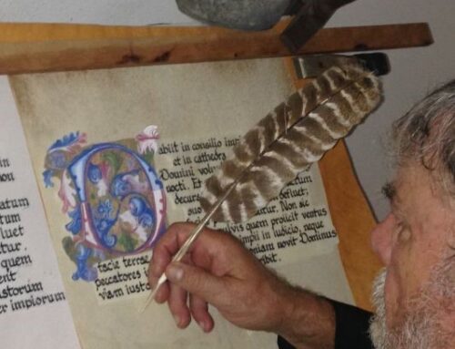
RL: I believe that Illuminated Manuscripts were the most beautiful and detail-oriented masterpieces of their time, but unfortunately only the wealthy could afford them. When books became easier to obtain, we lost some of the art but we also saw positive changes such as higher literacy rates in society as a whole. The first versions of ebook readers did not provide any of the frills, there were merely words on each “page.” Newer readers such as the Nook Color, however, have brought back some of the art previously lost. It seems to me the goal of colored readers is to provide the most real experience possible which includes making even the pages feel more real. For example, one can download children’s books with full color, pages that “turn,” and even a voice to read the book to us. This is taking the artwork, page design, and goal of the author to a whole new level. I believe this small step is already starting to prove how important art is to society. These huge steps have been made in the last few years so imagine what 10, 20, or 30 years down the line may look like. The relevancy of page design depends on the future but I feel there is a bright one ahead.
LM: Self-publishing is the wave of the future in the world of books, and that wave is crashing against the walls of the so-called “traditional” publishers even now. Self-published books will be more and more common as we pursue this return to the roots of story-telling. What do you see as your place in this transformation?
RL: With any new direction you either adapt to it or get swallowed by it. I think this new wave of self-publishing leaves an author with the opportunity to take more creative direction in the final product. As a designer that means I want to accurately portray the authors’ ideas and give them a design they are proud to wrap their book in. It also gives students or less experienced designers a chance to become a part of something they may not have been able to experience before.
LM: Some authors are going to want to exert a great deal of control over their covers, and may veto design after design. Others will have no idea what the cover should be, and will expect you to simply “go and do it.” How do you see yourself dealing with these extremes, and what do you see as the perfect cover design process?
RL: A graphic designer’s job is to offer what they believe is the best and most effective solution. One learns that nobody views things in the same light and at times that may be true of an author and cover designer. The only way to reach a quality solution is to work together. My process generally is to take ideas from my client (if they have any), begin my process, and go from there.
LM: Tell me a little about your tools and procedures. What media and/or software are you comfortable in, what sort of files are you able to provide, etc?
RL: In my Graphic Design 2 class we have a project in three areas of design: identity, book cover, and brochure. I have learned that although the end result is important, the process is most important. My professor requires a “process book” for each assignment. There I include word lists, influences, ideations, separate solutions, refinements, and a final product. This has become my procedure for a successful final design. I have used the Adobe Creative Suite since version 2 and now use (and own) their latest version 5. I am proficient in Illustrator, InDesign, and Photoshop and would rank them by favorite in that order. I can provide any file type needed for print: tiff, pdf, giff, jpg, and png.
LM: What about pricing? Have you done enough research to know how much to charge? Copyright to your covers would remain in your name, of course, and attribution would be expected, meaning something along the lines of “Cover design copyright 2011 by Ryan Lybeck.”
RL: I have researched things like prices, etc. and have talked to my design instructor about it but have not come yet come to a conclusion. It is difficult to make a decision while taking into consideration that I am a student with little professional experience. I do love designing and there was a time when I probably would have said I’d do some work for free. But as it stands now I have a heavy course load at school and don’t have the time to take on more projects that I’m not compensated for. Not only am I a student but I am head of the house and the provider for my family. If I was to take on more designs I would love to have the experience of dealing with real clients and transactions.

RL: The greatest book cover of all time is Fear and Loathing In Las Vegas: A Savage Journey to the Heart of the American Dream. The cover version I am referring to was published on November 11, 1971 by Random House. This cover captured not only the essence of the author but also the playful, rambunctious, crazy, and outrageous premise of the book. The originality Ralph Steadman created is unbeatable. He perfected his niche in a pen and ink style and created something one of a kind. His work is not only on the cover but throughout the book itself. This is an instance where the cover became more than just a cover. It became ingrained in the pages and propelled the book up to an even higher level of excellence. This is an example of truly amazing design.
For further information, please contact Ryan directly:
Ryan Lybeck
thevestiphobialives (at) hotmail (dot) com
Get an Editorial Review | Get Amazon Sales & Reviews | Get Edited | Get Beta Readers | Enter the SPR Book Awards | Other Marketing Services












Ryan,
Hmmm, interesting, and informative comments on book cover design and its related, but different realm, graphic design.
My two cents worth…First, whether you need front cover only[for an eReader upload] or a full cover jacket…you NEED a trained, professional designer. [None of this ppt stuff unless you are only going for the friends-and-family plan and that is only about as far as your book sales will go]
Second, I’ve seen some really great designs, until they are shrunk down to the size of a postage stamp [which is the size of the ‘book icon’ that Amazon, or most book sales sites will give you] and they lose their appeal. So, take that real cool design, shrink it down to 25% and if you can still make out the title and it ‘pops’ – you are on the right track.
Cost? My designer charges base rate $500 and then for each ‘ego tweak’ I pay her $100 – she puts up with my idiosyncrasies, which is worth a lot more than she charges me. I’ve seen [here in Seattle] anywhere from $500 base, to $1200, to $3000.
They say, “you can’t judge a book by its cover” but most discriminating readers do! Best Wishes, Emily