 I have been working my way through the Platform/Promo Lessons in Publetariat’s Vault University curriculum by April Hamilton and Zoe Winters (I was fortunate enough to win access to Vault University as a winner of Publetariat’s First Anniversary Contest.) While I don’t plan on revealing any detail on the excellent material presented in this curriculum (if you are interested, the fee is just $5 a month for monthly lessons, and I would highly recommend signing up and/or purchasing a copy of April Hamilton’s Indie Author Guide), I am using the subject headings of the sixteen “lessons” in the curriculum to evaluate my own attempts at promotion of my historical mystery, Maids of Misfortune: A Victorian San Francisco Mystery. As someone who has been teaching (and therefore evaluating students) for 35 years I figure it will be a humbling experience to see how well I have learned my lessons!
Over five years ago, in one of my last attempts to get an earlier version of my book published through traditional means, I went to a local writers convention where numerous speakers talked about the need to establish a brand. At the time, I remember being discouraged by the news that marketing departments of traditional publishers seemed to have achieved the ascendency in publishing, and that only those authors who could demonstrate a sure-fire market for their “brand” had a hope of getting published. Nevertheless, I had to admit as a reader I responded to the visual cues book covers and posters offered me when I browsed bookstores, looking for the latest work by a favorite author, or looking for new authors to try out. If this is what was meant by a “brand,” well, that I could understand!
Consequently, a year ago as I began to rewrite my manuscript, I also began to think about how I would establish those visual clues for my future readership. The most obvious information I needed to convey about my book was that it was an historical mystery set in the Victorian era. The book was also to be the first in a series of mysteries with the same protagonists, set in San Francisco, emphasizing different female occupations of the era. Ultimately the choices I would make for the title of the book, the name I used as author, and the cover of the book would all be part of providing the visual clues that would “establish my brand.”
Title:
I had already decided on Maids of Misfortune as my primary title, (it sounded dramatic, domestic servants play key roles in the mystery, and no other books by that title seemed to exist), but now I had to decide on the subtitle, which I would carry through the subsequent books in the series. I had done enough reading about the increasingly important role the internet plays in modern book marketing to know the title of the book could play a crucial role in determining whether or not a potential reader could find my book. Using “late Nineteenth Century” sounded too academic, and I eliminated the two most obvious alternative terms used for the late Victorian period, “Gaslight” and “Gilded Age” because a google search revealed too many other authors with multiple books had already expropriated those tag lines. So I decided simply to make my subtitle as descriptive as possible, referring to both the time period and the setting, and the sub-title A Victorian San Francisco Mystery has certainly done the trick.
If you do a search in Amazon books and use the term “historical mystery,” over 7000 titles pop up, but when you put in “victorian mystery,” the list narrows to 323. In addition, after being out for 6 months, Maids Of Misfortune is second on that list. If you put in another term that is popular for series with female protagonists “women sleuths” you get over 11,000 titles, but when you put in the term “San Francisco mystery” you get 589 titles (who knew there were so many mysteries set in San Francisco!) and I am pleased to say that currently Maids of Misfortune comes up first on that list. My intention is to use this subtitle on the rest of the books in the series, which should cement it as part of my “brand.”
Author’s Name:
My birth certificate says Mary Louisa Locke, but growing up I was always called Mary Lou, a hokey 1950s sort of name (for those of you out there of the baby boom generation-all I need to say is Ricky Nelson). I never wanted to be called Mary (my grandmother’s and oldest Aunt’s names), and Mary Louisa sounded so old-fashioned-so Mary Lou it stayed. When I married in 1972 (not coincidentally the year Ms Magazine started) I decided to keep my own name, so I remained Mary Lou Locke. When I got my doctorate and started teaching, I shifted to Dr. Locke as the way I introduced myself because it was easier than correcting people when they called me either Mrs. or Miss, since nobody seemed willing to use Ms. Besides, as part of a small number of women with doctorates in history, I was proud of the honorific. Meanwhile, my husband and close friends got in the habit of calling me Lou.
So, what variation of my name should I use as an author? I find it amusing to realize I never spent any time as a girl wondering what my “married name” would be, but I have spent a good deal of time over the years wondering what my pen name would be. In part this was because when I started writing a novel, I was at the beginning of my academic career, had written several articles as Dr. Mary Lou Locke, and thought that it might be useful to keep my fiction and non-fiction personas separate. But fast forward thirty some years, and I was now at the end of my academic and teaching career, and this motivation was gone. I tried different iterations of my name (including adding my husband’s last name in the mix) but the one that sounded the most Victorian to me was M. Louisa Locke. In fact when I said it out loud, it always reminded me of the name “Louisa May Alcott,” and what could sound more Victorian to potential readers than that? So M. Louisa Locke became my pen name, and not a few people have mentioned how very “nineteenth century” it sounds.
I also decided to use that name as my domain name for the website I established, for all social networks, and my email address. It was a name that didn’t show up when I first searched for it, so I knew that by using it consistently it would also start establishing a high web presence. Now when you google M. Louisa Locke it is the only link you find in the first page of listings.
Cover:
There are numerous articles on why the cover design is one of your most important marketing tools, and I decided that this was one area of self-publishing my book that I did not want to do myself. However, one of the benefits of publishing my own book was that I could have full control over the final design of the book cover. After doing some comparative shopping on the web, looking at book covers of historical mysteries, and asking everyone if they knew any professional designers, I came up with someone who met my needs perfectly. I wanted someone who was not only a professional designer, but someone who might actually read and enjoy the kind of light, romantic mystery I had written. Michelle Huffaker, who designed the cover of Maids of Misfortune, was local, so I could actually talk face to face with her and lend her books I had accumulated on Victorian fashion, interior design, architecture; she was both an artist and a professional web-designer, so she knew how to present for the web and prepare images for electronic books and print on demand; and she was a reader of light fiction (and didn’t begin her design until she had read the completed manuscript.)
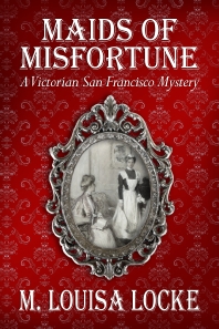
I knew what elements I wanted on the cover. I wanted the background of the cover to represent Victorian wallpaper, which was characterized by linear patterns and I wanted a deep red, which is a signature color of the Victorian period. In the center of the front cover I wanted an illustration of a mistress and servant I had found in a late Victorian magazine.
Michelle Huffaker gave me that and more (and at a very reasonable price).
If you look closely at the cover you will see that she manipulated the classic Victorian pattern she found for the cover so that the edges were darker than the center, and, as a result, it really looks like the kind of fading you would find in old wallpaper. She researched Victorian fonts, finding fonts that not only stand out, even in small thumbnails pictures, but also evoke the nineteenth century. And she placed the black and white illustration into an ornate frame, again very historically accurate, so that it looks like you are seeing a reflection in a mirror. I have gotten nothing but compliments on the cover, including how professional it looks (a real plus for an independently published book.)
I couldn’t be happier, and I feel that the cover design, along with the title, and my name, provide the strong visual clues I was looking for. I don’t think that anyone who sees the book would think they are looking at a contemporary mystery, or a hard-boiled detective novel, so I feel confident I am on my way to establishing my “brand” as the writer of cozy-style, historical mysteries that are set in Victorian San Francisco.
Get an Editorial Review | Get Amazon Sales & Reviews | Get Edited | Get Beta Readers | Enter the SPR Book Awards | Other Marketing Services










So here’s the problem with your branded search concept: Readers need to know to enter the search phrases that will bring up your book. The reason there a numerous “Gilded Age” or “Gaslight” search results isn’t because the authors made a mistake in picking a crowded brand, it’s because those are the most likely phrases fans of that era will use. Ditto “San Francico Mystery.” Do most–or any–readers care if a Gilded Age mystery takes place in San Francisco? Will real people, without prompts, search on the terms you selected? You narrowed the search results, but did you thereby restrict the probability of coming up on the vast majority of search lists?
Different people respond to different triggers. I, for one, do care if a Gilded Age mystery takes place in San Francisco. I love The Bay Area, and I am intrigued with any sort of mystery in that great historic era. I think I’m a real person.
Thanks to both Eric and Robert for your comments.
My concern about using Gaslight or Gilded Age was primarily over the fact each term had single authors who had listed a very large number of already published books with this as the tag line, and I was concerned that at least at the beginning my title would be hard to find in the list of other books or that readers might think my book was part of an established series. In addition, my choice of the term Victorian, although it was also used by other authors, would capture most every reader who was looking for a mystery in my time period.
Also, Gilded Age, in particular, while more accurate for the exact time period, is not as well known as the term Victorian-and for a non US reader might not even convey the historical period. My hope was that anyone who is interested in mysteries about the 19th century would use the term Victorian as one of their key words-and would then find my book. Currently if you put in Victorian Mystery in Amazon Books, although there are numerous other books listed with this term somewhere in the title, my mystery, Maids of Misfortune, shows up as #2, so I can feel confident that it is a decent key word for me.
As for deciding to put in San Francisco into the subtitle, I have to agree with Robert. One of the criteria I use for choosing mysteries is the geographic location, and by putting the city name in the title, this also immediately clues the reader to the fact that this is an American Victorian mystery, which is useful information. I am also happy with the idea that someone who is simply looking for mysteries set in San Francisco (like Laurie King’s Kate Martinelli series, or Marcia Muller’s Sharon McCone series) would find my book and be intrigued.
Finally, after Eric’s comment, I will be careful to include both Gilded Age and Gaslight mystery to the tags for my books to ensure that people looking specifically for this period will have an easy time finding them.
You have certainly put a great amount of thought and effort to your tags,Mary Lou. I was tempted to say Doctor, but I couldn’t resist picking up on the Ricky Nelson statement you made. He and I are/ were very distant cousins. Good luck and happy writing.