by CATHI STEVENSON
BOOK REVIEWERS notice it. Bookstore owners notice it. Distributors pick right up on it. Online bookstores avoid it. Customers shun it and don’t even know why. What is it? Bad book cover design. Nothing says “amateur” faster and more effectively than a poorly designed book cover.
Even well-chosen fonts and high quality images can’t guarantee a good cover and that’s because there are dozens of little details no one outside the industry is likely to share with you. Well, today I spill the beans, or at least a bowl full.
First of all, I’m going to tell you not to believe me. Don’t. Why should you? (Well, okay, I have been doing this for decades, but still…). What you should do is track down the websites of the major players in publishing: RandomHouse.com and SimonSays.com are two most people are familiar with and confirm what I’m telling you by studying the covers on those sites.
More than 90 per cent of the books produced by the traditional houses will follow the guidelines I’m about to share. Why not the other 10 percent, you ask? Well, even a traditional house will have bad designs from time to time and even the most fundamental rule of design can be broken successfully by the right designer. There will always be exceptions. Unfortunately, most self-publishers don’t have the time or the budget to gamble, so it’s much safer to create an eye-catching, wow-factor cover that obeys the rules.
The Secrets
1. Kern your title. Kerning is the spacing between the letters. Fonts don’t always produce even spacing right out of the starting gate, so it’s necessary to get in between the letters and tighten them up. The spaces should be even. The letter “y” is probably the most common culprit of being spaced too far from adjoining letters.
For an example of what I mean, click here.
2. Choose colors carefully. Red doesn’t print well on most shades of blue or black or purple. And some color combinations create “visual vibration” making it impossible for a reader to stare at the image for more than a few seconds.
3. Avoid using more than two fonts on a project. The best combination is a serif typeface (the fonts with little “feet” on the letters, like Times and Garamond) and a sans-serif (fonts that are straight up and down like Arial, Impact and Helvetica) or a script in place of one of them.
4. Never use all uppercase letters with a script or italic-styled font. It’s impossible to make out what the word is.
5. Avoid using images that illustrate a word in the title, especially if it has nothing to do with the content of the book. For example, if your book is titled A Blueprint For Happiness, do not put an image of house blueprints on the book. You’re not selling house blueprints.
6. If your book is non-fiction, particularly self-help, make sure you illustrate the solution (what you’re selling), not the problem. If your book is called How To Be Happy At Work, then don’t put an image of a stressed-out person on the cover. When is the last time you’ve seen a diet book with an obese person on the cover?
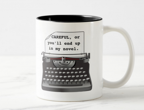
7. Don’t get so desperate for an image that you use bad clip-art or outdated elements. Today’s writers use computers, so a picture of a manual typewriter is probably not a good choice for a book being marketed to freelance writers; Likewise, rotary telephones and people wearing hairstyles and clothing from the ’80s, (unless of course, those retro elements have a purpose that pertains to the story). If you can’t find an image, go with a text-only design. Plenty of best sellers boast text-only covers.
8. Avoid clichés. No more puzzle pieces, chess games or handshaking on covers. It’s all been done.
9. Avoid overused fonts. You won’t find Helvetica, Arial, Times or Comic Sans on books produced by professional publishers. There are hundreds of thousands of fonts out there, choose another one.
10. Don’t use your title to frame a boring background image. We’ve all seen them — a cover that is nothing but a sky with a few clouds or a stucco wall, with the title crammed at the top and author name crammed at the bottom. That’s valuable title real estate you’ll be sacrificing for an image that no one is interested in.
Get an Editorial Review | Get Amazon Sales & Reviews | Get Edited | Get Beta Readers | Enter the SPR Book Awards | Other Marketing Services













Thanks this was really informative and useful for my project.
BOOK-COVER DESIGN ADVICE (for Cathi)
How much to kern is a matter of concern.
Visual vibration causes consternation.
Fonts should be few; in fact, two will do.
Zap all-caps QUICK in italic or script.
Let images illustrate (not negate or duplicate).
Avoid cliches, plus clip-art way out-of-date,
plus fonts too overused and tame.
Don’t use your title as a frame.
Great solid advice, nice post, Cathi!
One of my (least) favorites is using too many “effects” in your graphics program because it looks neat on your screen. Polished, embossed, distressed, hi-gloss etched type looks amateurish. Better to be too plain.
Best of all, work with a designer. sit down together, with a bunch of covers from books whose readers you want to appeal to, and then think how to conjure up that vibe yet be specific to your own vision. And if you possibly can, get an original hi-res image for your cover – complete with full rights and release contract if you’ve used a model. That takes away all the IP worries. AND it gets over the biggest killer for cover-designs – the feeling that they’ve been cobbled together by numbers. My designer had READ MY BOOK (essential), was a fan of the genre, and pulled together a photoshoot to get the image exactly right. It cost me just $150, and the result is a cover that feedback from store owners confirms has long since paid for itself
I think it’s worth saying, too, for self-publishers:
– Don’t use low-res images! and
– always check the copyright.
Hey Dan, you got a designer to read your book, design your cover and do a photo shoot for $150? Jeez, even designers have to eat!
Cathi,
Just an excellent article and one that should be read by anyone planning to self-publish a book.
George
http://www.book1blog.com
Great article! I did not do too much with my cover art on some of my books. I was too afraid to try. I did try my hand on a few and they didn’t come out too well. Your article would have helped me then, but at least I know now and won’t make the same mistake twice! Thanks for sharing all the great info!
One of my friend is writing a book; i will definitely recommend your steps to her. Thanks for sharing.
Hello – I hope this doesn’t come across as disparaging, but the visual example used in tip #1 is not a very good example. YES you would want to fix the individual spacing after the cap Y, but PLEASE don’t squish all the letters together as in the second example. You could get away with it, if you had a good reason, but only with certain fonts. The font used in the example looks better with some room to breathe. If you want this type of detailed advice, read Robert Bringhurst’s Elements of Typographic Design. It’s got all the “secrets” you could ever hope to find.
Hi Christina, thanks for your comment. They do look a little tight on second glance. I had a well-respected designer friend recently criticize me for leaving a bit too much space, LOL so maybe I’m overcompensating (my fault to doing things in a hurry). But, on book covers it’s quite often necessary to make things tight and I don’t think that it’s hampering the readability of the text. There’s also adequate space for clean printing. I guess my main point was to pay attention to the spacing so there are not uneven gaps. I don’t think the average self-publisher is going to invest time into studying typographic design for use on one title, and since so many people choose to create their own book covers, a little attention to these details certainly won’t hurt. However, the more input they have from people such as yourself, the more successful and professional their designs will be. Thank you for taking the time to point that out to me. 🙂
Yes I do agree with your main point! 😉 Bringhurst is quite dense but he does cover everything you need to know to become a general typophile. I read the second part of this post, looks like all the big points are covered there as well. Good job 🙂
Okay, but somewhat bland. How about some real advice like where is the best place for title and author – top or bottom of cover? Which should go where, or doesn’t it matter?
@Lars All of the layout options (where to put the title, etc) all depend on too many variables to give a simple answer. When I design covers, I take into account the amount of words in the title, does the author use a middle initial, even the amount of letters in each word. It is a complex formula that changes with each cover…
An old post, but obviously still relevant and it saved my potential butt! I had thought of using a pic of an exasperated person on the cover of my book going for the thought that folks would identify with the situation, but thinking about it, that is exactly like putting an unfit person on the front of a ‘get fit’ book… So many thanks for that 🙂