by CATHI STEVENSON
Studying good book covers is not difficult. What’s difficult – at least for many novice publishers and project managers, is to discern what constitutes a bad cover and to avoid those things. Most poor cover designs can be explained by a simple lack of knowledge.
One of the most common errors is using the wrong image, particular for non-fiction. Remember, your non-fiction book is selling the solution, not the problem. If you’ve written a diet book, you’re selling fitness and slimness, so do not put an obese person on the cover. If your book is about raising a happy baby, do not put a crying toddler on the cover.
If there’s no way to illustrate your solution, then use a text-only cover, or one with an abstract background for detail, but no feature photo or illustration.
Another mistake is what I call “image desperation,” either there are no images available or the publisher’s budget is too small to pay for one, so he’ll “make do.” It’s never okay to put a typewriter on a guide for modern writers. No modern writer is using a manual typewriter, and unless it has some direct meaning to the book, forget it. Likewise, don’t use a photo of tattered old books with such a project. Does anyone really want to publish a tattered looking book? If the book happens to contain a significant amount of information on using vintage books or library resources for research, well then, maybe such an image image will work.
Then there’s the cliché. Puzzle pieces, chess pieces and light bulbs have pretty much been done to death. Unless you’re confident that you’ve thought of a completely fresh way to handle these common elements, don’t go there. The paper in the typewriter, the close-up of the keyboard, the giant calligrapher’s pen – they’ve all had their day, too. Let them rest in peace. One of the worst mistakes I’ve seen in using the cliché was a book on business strategy that featured a photo of a chess piece: the pawn. Who wants to be the pawn?
Then there’s the font and color issues so many inexperienced project managers don’t seem to understand. Visit the websites of major publishers such as Simon and Schuster, Penguin Putnam and Random House. How many fonts do you see used on each cover? Rarely, will you see more than two. You will not often see small red lettering on black, it’s too difficult to read, but it seems to be a favorite choice with small, inexperienced publishing houses. Red also doesn’t print well on many shades of blue and vice versa, as it’s very hard to stare at for more than a few seconds. Examples of such poor color combinations can be viewed at, http://tlt.its.psu.edu/suggestions/accessibility/color.html, scroll about 80% of the way down.
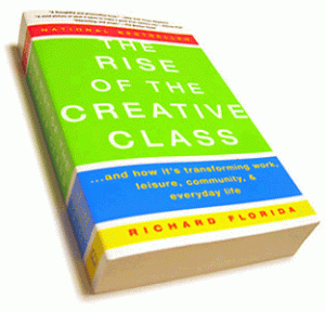
Even if you’re completely new to this business and on a limited budget, don’t feel discouraged about cover design. It’s definitely not necessary to spend a fortune on images and fonts to create an effective book cover. Richard Florida’s, The Rise of the Creative Class (Basic Books, Reprint, 2003), simply has the title bumped up so it appears to be “rising.” A very effective, very inexpensive design idea.
Another nice design by Basic Books is Hunger: An Unnatural History by Sharman Apt Russell (Reprint, 2006). A wonderful photo shows a well-worn fork and spoon that piques interest in the contents.
On the cover of the book Heat, by Bill Buford (Knopf, 2006), the large letters in the word “Heat” appear to be melting. Placed on a solid yellow-gold background, it’s very eye-catching.
And to see that overused image of a stack of old books put to really good use, check out The Archivist by Martha Cooley (Back Bay Books, 1999).
Any of these designs could be created with a limited budget.
But it’s not just the images and general design that are important. It’s the small details that a professional cover designer will understand that work to pull the cover together and give it that polished, professional look. Problem areas are kerning (the space between letters). It’s not uncommon to see an inexperienced designer leave too much space between letters, or uneven spacing. As a general rule, kerning should only be tampered with at 18pt or more, but it’s very important and it’s necessary to have the proper software to be able to manipulate the amount of space between each letter.
Poor font mixes can also make a great design mediocre. It’s rarely a good idea to mix the same style font (script, sans-serif, serif) with each those of other families within that style — for instance using two different script fonts. If you want to use a script font on the title, then find a complimentary serif or sans serif font to go with it, not another script. And avoid trendy or unprofessional fonts. Comic Sans has no business on a book cover and Papyrus, while it is a popular font, is now being overused.
Just remember, it takes the same amount of money to produce a good cover as it does to produce a bad cover.
Get an Editorial Review | Get Amazon Sales & Reviews | Get Edited | Get Beta Readers | Enter the SPR Book Awards | Other Marketing Services


Somehow I think that if a book on raising children had a crying baby on the cover then I would be able to relate to the cover because mt children cry all the time. Same way, if I were looking for a diet book, seeing an obese, miserable looking man with food scraps on his clothing definitely would look amusing and appealing. I believe a cover needs to be appealing as well as relevant to the book in order to truly be a good book. The book with the plate and fork on it, Hunger, was appealing to me because it showed an empty plate, but does it look interesting maybe, but when I see something like that does that really peak my interest as opposed to is it were called hunger with a picture of a huge plate full of food on it! Sometimes ironic and non-serious covers work well. That book about creative businesses, that cover sure wasn’t creative!