 Running this website has been eye-opening, in that I now have some sense of what it’s like to be a literary agent being inundated with queries from eager writers. If you want some sense of what it’s like, check out Nathan Bransford’s blog for his recent query contest, in which he posted 50 different queries from readers of his blog.
I can imagine at some point turning into the Query Shark (Janet Reid) and wanting to rip apart queries because it can be frustrating to see the same problems again and again. As time goes on and I become more familiar with the self-publishing output – I have not read as many self-published books in my life as I’ve read in the past four months – I’m getting a sense of how I can quickly discard a query based on how someone writes their email, the copy on their website, or, worse yet, the cover of their book.
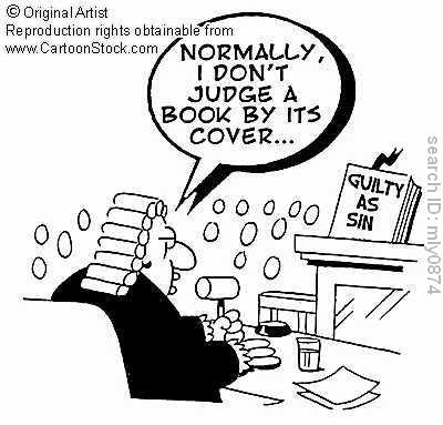
They say, “Don’t judge a book by its cover,” but this doesn’t apply to self-published books. If a traditionally-published book has a bad or non-representative cover, this doesn’t fall on the shoulders of the writer. It’s the problem of the book designer at the publishing house and it’s often out of the writer’s hands. A bad book cover might be a shame, but it might not be a reflection of the writing inside. With a self-published book, however, the book design is a pretty clear window into the writer’s intentions. And I’m finding that if a book doesn’t have a decent book cover, the writing almost always is a reflection of that cover.
Writing is visual – a writer’s trying to paint a picture with words. If a writer does not have the visual sense to put a book cover together, it’s possible that they’re not going to be able to write a compelling book either. I think of the best, and most inventive, movie directors: Martin Scorsese, Paul Thomas Anderson, Quentin Tarantino – these directors are all known for the soundtrack and the score. A good film director almost always has a good musical sense, as music can change the meaning of a movie scene entirely. A director needs to know how a movie sounds as well as looks.
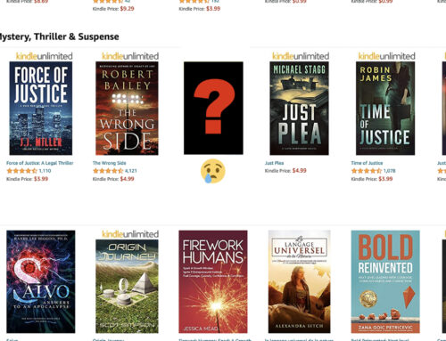
I’d say that writers need to have a good visual sense in the way that director’s need a talent for picking music. They need to be able to picture what they’re writing. I don’t really want to single out any covers here, but there are a lot of self-published book covers out there that can make you turn into a snarky agent thinking, What were you thinking? Call it #bookcoverfail. Well, I’ll single out one:
The writing in this book isn’t actually bad, it’s a good enough read, if not breaking any ground, but look at that cover. The font is chosen without care and the title and author name are kind of slapped on the book. On the spine is a publisher’s logo that is pixelated and unreadable. The author photo on the back has the same problem. If you didn’t care enough to make a decent-quality cover, why should someone take the time to read the book? Especially a book that’s almost 500 pages long. Self-publishers are already starting at a loss to be taken seriously, and this isn’t going to help a book find readers.
An author’s website can also be problematic. Authors: get this together before submitting your book to reviewers, as a reviewers (should) take this into account. I haven’t read this book yet but take a look at this webpage, it’s all over the place.
There’s a jazz soundtrack, a book cover with a confederate flag, and an author photo with the author in – I’m guessing – a Scottish outfit. How do all these things go together? At the top is navigation for “Page 2” and “Page 3” that have no content. The excerpts of the novel have no indentation or space between paragraphs, making it more difficult to read. Now, how is a reader supposed to think that a book is well-crafted if this is how the website is designed? The book might be great, but the website is not.
As I’ve mentioned here, I don’t like ripping into writers – as self-publishers are going to have trouble finding readers even with excellent reviews. But these issues are enormously important – if you’re bothering to put out the book, every element of the book needs to be professional.
Get an Editorial Review | Get Amazon Sales & Reviews | Get Edited | Get Beta Readers | Enter the SPR Book Awards | Other Marketing Services










Yes!
Luckily I have a book designer/aspiring writer who attends my same critique group. She gave me some advice and prompted me to do way more work on my cover than I first thought I needed. I’m not saying my cover is perfect, but it is now much more indicative of the story and the genre, and doesn’t look like a high school art project.
ALWAYS judge a book by it’s cover. This is a natural inclination for human beings and we might as well own up to it by now. Besides, the adage actually applies to not judging a person by their appearance, and not to *actual* books.
Your cover definitely looks good – great sword between the title, good placement of the name and the title. Good that you put some extra time into it.
The website misspells “Faulkner.”