I’m gearing up to finish and release my novel. Note: anyone waiting for reviews, sorry for the extra delay, as I’ve got a lot on my plate right now, revising my novel and putting it together. I’m still reading and reviewing, just not as quickly.
My cover designer has come up with two different covers. I’m not going to give a synopsis because I’m curious what people think on a basic browsing-on-the-internet level. Please vote below.
Get an Editorial Review | Get Amazon Sales & Reviews | Get Edited | Get Beta Readers | Enter the SPR Book Awards | Other Marketing Services


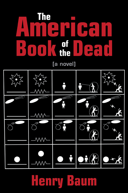









This won’t help at all – I like the black one more on a design level, but feel that if presented with the two, I’d be more interested in reading the white one.
That’s interesting. I’d originally chosen black, but Brian makes a good point.
IMO, white might actually be more confident. (If that makes sense.)
I like the black one, it’s no contest for me. The white lacks visual impact, especially considering the title of the book. You can’t have a post-apocalyptic book about ‘the dead’ whose cover is hospital-white. That being said, I can hardly wait to read it!
I’m going with the black. Thanks to everyone who voted. I was leaning that way and 73% in favor helped. My last book had a white cover – call me crazy, but I don’t want to have two white books in a row. I initially thought the black cover was too bleak. The book’s about the end of the world, but not unredeemably dark either.
I would re-do the book cover entirely. What you have now looks overly-done, too complex and cryptic, it lacks impact.
‘Cartoonish’ is a word which comes to mind. Try to think more ‘off the wall’, it doesn’t have to immediately relate to the subject matter. Consider a simple symbolic visual reference from the Cherokee Nation for instance, or a Runic symbol.
I’m sure a great deal of time and effort went into what you have, and I appreciate that, however the challenge is ‘visual impact’, which unfortunately, you do not have.