
It’s certainly possible to make your own cover using photo-imaging software, but according to cover designer Cathi Stevensen, owner of Book Cover Express, that’s not always – rather, is very rarely – a good idea.
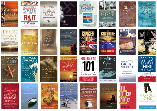
Cathi discusses what every cover should have and why you really shouldn’t make your own. She also shares some of her favorite covers in the interview she granted SPR.
Self-Publishing Review: First, Cathi, how did you get into the business of designing book covers?
Cathi Stevensen: I’ve been working in prepress since 1981. After university, I became a features’ writer for a major newspaper and also did page layout for them, and then I went freelance as a writer. At some point in the late ’90s I was making e-book covers and one day the publisher asked if I could make a print book cover and a new business was born.
SPR: How important is it to have a good cover?
CS: I think it’s much more important now that books are being sold online than it was years ago. People are scrolling through online bookstores as fast as their mouse will let them, and if your cover doesn’t say, “Hey, stop, look at me…” it’s going to get overlooked.
SPR: What DOES say “Hey, stop, look at me,” in your experience? Bright colors? Simple or complex graphics?
CS: I like a quiet combination of text and colors. You most often see them on books aimed at women (I guess that’s why), or spiritual books. That doesn’t mean it’s the best option for every book, though. That’s probably not going to work for books about finances or nutrition. It really depends on what genre we’re talking about.
SPR: And how important is the font choice the author uses for the title and his or her name?
CS: It’s important that the style and type of font reflect the book. You don’t want a fancy script font on most business books, and you don’t want Comic Sans on anything. Ever.
But, as far as a choice between say, Garamond or Bembo, a lot of that would just be personal preference.

CS: It reflects the tone of the book and it definitely appeals to your curiosity.
SPR: What book covers on store shelves have stood out to you? Are there any you remember because they were either so effective or so poorly designed?
CS: I really like cover for The Stories of Vladimir Nabokov, which was designed by the Doyle Partners. They also did The Book of Lamentations by Rosario Castellanos. I dislike covers that show a disregard for detail.
SPR: What key elements will an effective book cover have?
CS: It will work to represent the book; Whether that’s through creative type placement, or color or an image, or many different factors combined.
SPR: Hiring a cover designer can be expensive, for some, so many self-published authors will design their own covers. What are some common mistakes they make?
CS: Designing their own covers. I used to say anyone can do it with enough research, but I no longer believe that. An amateurish looking cover is simply going to let potential buyers know you couldn’t afford a designer and therefore probably couldn’t afford an editor, an indexer or a fact checker. The last thing you want in such a competitive market is to look like you don’t know what you’re doing.
SPR: What are some obvious giveaways that a cover has been designed by a non-professional?
CS: Usually the fonts and the fine tuning, such as letter spacing. Too many drop shadows, gradients, bevels and the style options that come packaged with Photoshop are often a giveaway that it’s a do-it-yourself job. Some of the stock images are really overused, too.
SPR: Where do you get your images for the covers?
CS: I have a good collection of stock art CDs for which I’ve purchased commercial licenses and I also make a lot of my own backgrounds, and take my own photos. Like most designers though, I also use the stock art agencies and have the clients license the images, so they’re in their names and not mine.
SPR: How much do you charge for a book cover design?
CS: Prices start at about $800 for a trade paperback.
SPR: How long does it typically take to make a cover?
CS: Oh, gosh, that’s hard to estimate. Sometimes I spend hours just fixing hair on the author photo. Finding the right image can take entire days, especially if you have to read licenses or write for permissions… and fonts, well don’t even get me started on choosing fonts. Much of my time is spent gathering and preparing the elements before I ever get to start the design. The design itself, well, that depends on how good the elements are and how much work is necessary to pull them all together. Sometimes finding the right color to use on the title font so it stands out, but doesn’t compete with the image is tricky.
SPR: Where do you get your ideas? That is, do you ever read the book first to come up with a design, or do you ask the author what s/he wants on the cover? How does that work?
CS: It can work either way. Some authors have images they want to use, or specific ideas. I like a nice, thorough synopsis of the book with information on any metaphors and themes that might translate into a cover. It’s important not to be too obvious. Some people try to illustrate the title and not the content.
SPR: What advice would you give to someone who simply can’t afford a cover designer, but who wants to do their best at making their cover look professional? Is it a matter of image clarity more than it is, say, placement and size of the title on the page?
CS: I’ve seen some self-publishing authors who were also good designers. In general, I’d say save your pennies and produce the book when you can do it properly, otherwise you’re just advertising that it’s an amateur production. There’s too much competition out there for reviewers or the buying public to want to invest their time or money in something that looks less than professional. If it’s obvious you had no money for the book design, how much hope can there be the book was edited or fact checked?
SPR: What cover did you have the most fun designing?
CS: Actually, my two favorites were both passed over for one of the other proofs I offered the clients. I use one in my own portfolio with a different title and the other, I still hope to use someday if the right book comes along. Maybe I’ll have to write it myself.
Get an Editorial Review | Get Amazon Sales & Reviews | Get Edited | Get Beta Readers | Enter the SPR Book Awards | Other Marketing Services











Leave A Comment